
TL;DR
- One product rail on the homepage was holding a 15.7 MB GPU layer. Windowing it to 6 cards brought that down to about 8 MB, a 49% cut per rail.
- Five horizontal rails plus the base page needed around 80 MB of drawn pixels resident at the same scroll position. That is over what a phone holds comfortably, so iOS threw away tiles it still needed and redrew them mid swipe.
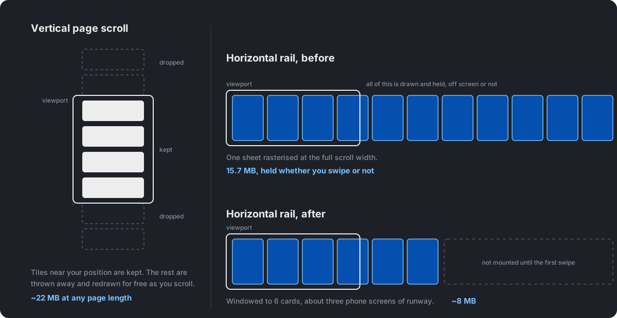
- Vertical page scroll is already free. The browser cuts the document into tiles and drops the ones behind you. A horizontal scroller gets no such treatment and is drawn at its full scrollable width up front.
- We burned six wrong theories on the rails because we kept reaching for CPU tools on a GPU problem. Removing every image from the page changed nothing, because grey pixels cost exactly what product photos cost.
- Virtualization fixed a separate problem on the collection grid: unmounting off screen carousel engines, not their pixels, cut the CPU cost that scaled with product density.
Two bugs that looked like one bug
We build and run the storefront for a menswear brand. Two complaints came in a week apart, both worded the same way: scrolling feels choppy on iPhone.
One was the collection page, a two column product grid on mobile that can run to 200 products. The other was the homepage, where five horizontal product rails sit stacked under the hero.
They had nothing in common. Every tool that helped one did nothing for the other, so the mental model below is the part worth keeping.
The thinking side and the drawing side
A phone renders a page with two workers.
The CPU is the thinking side. It runs your JavaScript, builds DOM nodes, works out where everything goes, decodes images, and runs your observers and listeners. Its cost scales with how many live things exist. CPU trouble feels like jank when things happen: a tap responds late, a re-render stutters.
The GPU is the drawing side. It holds finished, pre-drawn pictures of your content, called layers, and blends them into each frame. Its cost scales with how much drawn area it holds at once. A layer costs width × height × 4 bytes, and the content inside is irrelevant. A grey box costs exactly what a product photo costs. GPU trouble feels like jank while things merely move: a swipe stutters while the main thread sits idle.
One line to keep: the CPU pays for what exists, the GPU pays for what is drawn.
Why vertical scroll is free and horizontal scroll is not
This is the fact that decided everything, and most people never learn it.
Vertical page content is managed for you. The document's base layer is cut into small tiles, and the browser keeps only the tiles near your current position. Scroll on, and the tiles behind you are dropped automatically. That is why our homepage's #document layer measured 21.73 MB instead of 300 MB, and why a collection page with 200 products costs about the same GPU memory as one with 20. You get tile eviction for free, forever, going down the page.
A horizontal scroller gets a private sheet with no tiling. iOS composites every touch scrollable overflow region into its own layer so it can scroll without the main thread. That layer's backing store is drawn at its full scrollable width, not at the width you can see. A 12 card rail is roughly 2,400 CSS pixels wide, which at 3x device pixel ratio works out to 15.7 MB. The phone holds that whether or not the user ever swipes it.
So one very long vertical grid never blows up the GPU. Five horizontal rails stacked near a hero absolutely can.
The rails: six wrong theories
The symptom was oddly specific. Swiping a rail sideways stuttered, but only whichever rail sat in first position. Move rail 3 to position 1 in the CMS and rail 3 became the laggy one. The same component on the product detail page, with the same 12 products, was always smooth.
Everything we tried first was tested on a real device and changed nothing:
| What we tried | Why it could never have worked |
|---|---|
| Commented out every image | Grey pixels cost the GPU the same as photos. The sheet is the same size. |
| Cut card count and payload size | Rails had 10 to 12 products either way. Layer size was the bill. |
| Turned off carousel autoplay | The sheet exists whether or not it animates. |
| Hid the hero video | Same. That is content inside a layer, not area. |
| Dropped the hero to one slide | Same. |
Removed transition-all from button and link bases | Killed hundreds of layers, but they were 25 to 58 KB each. Memory stayed at 93 MB. |
Every one of those is a CPU lever or a content lever. Not one of them shrank a sheet.
The measurement that ended the argument
Safari Web Inspector, phone plugged in over USB, Layers tab, sorted by memory:
#document                              21.73 MB   ← the page's own tiled layer
div.no-scrollbar.overflow-x-auto…      15.70 MB   ← a product rail, full scroll width
div.no-scrollbar.overflow-x-auto…      15.70 MB   ← another rail
div.no-scrollbar.overflow-x-auto…       9.44 MB
div.no-scrollbar.overflow-x-auto…       8.37 MB
div.no-scrollbar.overflow-x-auto…       7.85 MB
everything else (500+ layers)          ~2 MB combined
────────────────────────────────────────────────
Layer count: 525          Memory: ~93 MB
Five horizontal scrollers came to about 57 MB. Add the base page at 22 MB and you need roughly 80 MB resident at once while standing at the first rail. Past the phone's comfortable budget, iOS starts evicting tiles it still needs and redrawing them during your swipe. Hence the stutter, with the main thread doing nothing.
Only the first rail suffered because the phone keeps drawn pictures for content near your scroll position. At rail 1, near includes the heaviest things on the page: the hero, the collection strip, the featured banner, plus rails 2 and 3 right below. At rail 3, the hero is two screens away and already dropped, so what is left fits. It was never the rail. It was the seat.
The fix: window the rail
Virtualization cannot help here. Placeholders keep the boxes, the boxes keep the width, and the width is the bill. The boxes have to actually go.
useRailGpuWindow mounts 6 cards instead of 12, which is about three phone screens of runway:
const [expanded, setExpanded] = useState(false);
const windowed = !expanded && totalCards > windowSize;
const visibleCount = windowed ? windowSize : totalCards;

// Expand on the rail's own scroll: covers touch, wheel and the arrow buttons.
// Armed only while visible, so the collapse's own scrollTo can't re-trigger it.
useEffect(() => {
  if (!scrollerNode || !windowed || !railInView) return;
  const expand = () => setExpanded(true);
  scrollerNode.addEventListener('scroll', expand, { once: true, passive: true });
  return () => scrollerNode.removeEventListener('scroll', expand);
}, [scrollerNode, windowed, railInView]);

// Shrink back once off screen, rewinding scroll so re-entry starts at the same window.
useEffect(() => {
  if (railInView || !expanded) return;
  setExpanded(false);
  scrollerNode?.scrollTo({ left: 0 });
}, [railInView, expanded, scrollerNode]);
Three things make this work in practice:
- Expansion fires on the rail's own
scrollevent, which covers touch, wheel and the arrow buttons alike, and never fires for vertical page scroll. It happens at the start of the gesture, so cards 7 to 12 exist before your finger reaches card 6. No visible pop in, and appending on the right cannot shift what is already on screen. - Collapse back to 6 when the rail leaves the viewport, rewinding
scrollLeftto 0. Without this, swiping all the rails to the end leaves every sheet at full width again, and coming back to rail 1 stutters exactly as before. We watched that happen on device. - The expand listener is armed only while the rail is on screen. Collapsing a scrolled rail makes the browser clamp its scroll position, and the rewind calls
scrollTo(0). Both fire the veryscrollevent that triggers expansion, so arming it only while visible means those events land on nothing.
Net result: at any moment at most one rail is full width, the one under your thumb. That is the state a product detail page is in naturally, and exactly why those rails were never slow.
Collapse tears down cards 7 to 12's DOM, the track shrinks, scrollWidth halves, and WebKit reallocates the sheet at the smaller size. That reallocation is the actual saving. What we keep: image files stay in the HTTP cache so re-expanding is instant, the full products array stays in props, and analytics impressions still fire on the full list rather than the rendered slice.
The grid: a CPU problem wearing the same costume
The collection page was the opposite organ. The tell was that the two column layout scrolled worse than one column with the same products and the same images. Only the on-screen density changed, which points at per-instance mounted cost.
A couple of small fixes came first and were worth doing on their own: an unnecessary backdrop-blur on the tiny carousel dots was making the compositor re-sample pixels every frame for a blur nobody could see, and a pair of layout reads inside a scroll handler were forcing the browser to stop and re-lay-out mid scroll. Both shipped. Neither explained why density was the thing that mattered.
A live carousel engine per card did. Every card with multiple images ran its own Embla instance, with a ResizeObserver, drag listeners and full slide DOM, the entire time it was mounted, however far below the fold. useVirtualization swaps far away card subtrees for placeholders of the same size and swaps them back near the viewport:
export function useVirtualization<T extends HTMLElement>(enabled = true, rootMargin = '800px') {
  const ref = useRef<T>(null);
  const [isIntersecting, setIsIntersecting] = useState(false);

  useEffect(() => {
    if (!enabled) return;
    const el = ref.current;
    if (!el) return;
    const observer = new IntersectionObserver(
      ([entry]) => setIsIntersecting(!!entry?.isIntersecting),
      { rootMargin },
    );
    observer.observe(el);
    return () => observer.disconnect();
  }, [enabled, rootMargin]);

  return { ref, shouldRender: !enabled || isIntersecting };
}
The 800px buffer is roughly two to three rows of a mobile product grid. Bigger means the real subtree is ready earlier and you see fewer placeholder flashes on a fast scroll, at the cost of keeping more instances alive. Two rules for callers: keep the ref on an element that stays mounted in both branches, or the observer loses its target and never flips back, and give the placeholder the same box as the real thing, or the scroll position jumps on every swap.
Virtualization was right here because the costs were all machinery: engines, listeners, DOM. Unmounting reclaims them. The placeholder keeps the card's box, which is fine, because the drawn area was never the problem on a vertical page.
What changed on real devices
| Before | After | |
|---|---|---|
| Heaviest rail layer | 15.70 MB | ~8 MB |
| Five rails combined | ~57 MB | ~8 MB plus four windowed rails |
| Full width rails at once | up to 5 | 1, the one being touched |
| First rail swipe | stutters, main thread idle | smooth |
| Two column grid scroll | worse than one column | matches one column |
The headroom matters more than the peak number. When the phone is not sitting at the edge of its budget, it stops evicting and redrawing tiles it still needs, and that is the work that was landing in the middle of your swipe.
That headroom pays out most on the devices that had the least of it. Older iPhones have smaller GPU budgets, so they were crossing the line earlier than our test devices. Low Power Mode makes it worse in a different way: iOS throttles clocks to save battery, so each redraw takes longer and is more likely to miss a frame. Cutting resident memory means there is far less redrawing to be throttled in the first place. We checked this by hand on device rather than instrumenting it, so treat it as an observation and not a benchmark: rails that used to stutter on an older phone in Low Power Mode stopped stuttering.
Why this matters more as you list more products
The two directions scale very differently, and that is the practical takeaway for anyone running a catalogue.
Going down the page, product count is close to free on the GPU. A collection page with 200 products costs about the same drawn memory as one with 20, because the browser drops the tiles behind you either way. What does grow is the CPU side: 200 cards means 200 carousel engines, observers and listeners sitting mounted. That grows in a straight line with the number of products, and virtualization is what flattens it.
Going sideways, the cost grows with the length of the list, directly. A 12 card rail is 15.7 MB. The same rail with 24 products would be roughly twice that, because the sheet is drawn as wide as the list is long. So the merchandising team adding more products to a "bestsellers" rail was quietly buying GPU memory, and nobody could see the connection.
Windowing breaks that link. A windowed rail costs the same whether the list behind it has 12 products or 60, because only 6 are ever mounted before you touch it. The bill stops depending on the size of the catalogue, which means the merchandising team can add products without needing to know any of this.
What we got wrong
We spent six theories treating a GPU problem with CPU tools. Every one was plausible, and one of them, removing transition-all from the button and link bases, even deleted hundreds of layers. It felt like progress. Memory stayed at 93 MB, because those layers were 25 to 58 KB each and we were deleting trinkets while ignoring a 15 MB sheet in plain sight.
The Layers screenshot took one minute and found what a week of code reading missed. If a swipe stutters while the main thread is idle, stop reading code and go look at the layer list sorted by memory. Ignore the layer count, hundreds of tiny link layers are noise. Read the top five rows. Anything above roughly 60 to 70 MB near a single scroll position on a phone is the danger zone. And if the same component is janky in one page position and smooth in another, it is almost never the component, it is the total drawn memory of that neighbourhood.
Two things are still open. The 6 card window is a fixed number picked because it is about three phone screens on the devices we care about, not something derived from the viewport, so a very wide screen gets more runway than it needs. And expansion is one way per visit: once you touch a rail we go to the full list and only collapse when it leaves the screen, so someone who swipes one card and stops holds a full width sheet until they scroll past. Neither has shown up as a real problem yet.